Surface Design: Research and Implementation


"Surface Design encompasses the colouring, patterning, and structuring of fibre and fabric. This involves creative exploration of processes such as dyeing, painting, printing, stitching, embellishing, quilting, weaving, knitting, felting, and paper-making."  - Surface Design Association, Candace Edgerly 

It is a technique commonly used by artists to manipulate any form of surface. In this week project for OBDF 210C, we would be briefly looking into surface design and some artists that utilize this process in their works.


Painting

A recent example of a surface design I recently had an opportunity to witness was created by Simone Elizabeth Saunders. Her diasporic art series entitled "unity", was featured at Contemporary Calgary from Nov 2021 - Jan 2022. 

Unity is a series of uplifting portraits of black women illustrated in a manner similar to tarot cards evoking ideas of magic and empowerment. visually appropriating Alphonse Mucha's greater arcana, but remixed in tufted paintings. 


Notice their arrangement of values in this section of the tufted painting above. We have a simple repeating pattern of Arcs but coloured with blue values receding into black. This creates the illusion of depth in a 2d surface, allowing the image of lady justice to pop out in the foreground.


Simone employs a creative application of surface design to compose visually striking portraits, we can see this in her complex arrangement of tufted fabric cleverly sculpting the subject's bodies, clothing, and intricate halos accompanying them. 

Chiyogami

The graphic, repetitive designs used on paper throughout the Edo era are referred to as chiyogami.
These patterns were initially woodblock printed for use in manufacturing paper dolls and minor accessories. Silkscreens were first used to apply these designs in the 20th century, and they are being used today.


Both titles are now used interchangeably as Yuzen textile patterns join the classic Chiyogami ones on paper. Simply because "Chiyogami" was first used to refer to paper, we have picked it (-gami means paper). (Washi Arts 2015)

Pattern Design Consumer Goods.

The next few examples are from Kangan Arora a Graphic Designer based in London known for her work in IKEA, TATE, Urban Outfitters. 

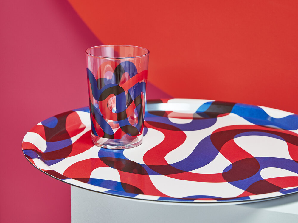
Her designs were used for textile prints, clothing, and ceramics. 

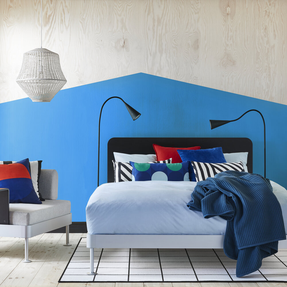
Svallerup and Majalotta IKEA spring/summer 2019


In this project, I would be developing a textile pattern I hope to eventually print into a sheet of fabric.

As seen below I've decided to recreate patterns slightly inspired by Kangans Aroras designs, and camouflage stripes mainly utilized by cuttlefish. But really I just wanted to design a decorative pattern that optically appears animated due to contrast. 


The striped pattern also appears to emphasize the bio-morphic shapes of the cuttlefish (above).


For my final design, I decided to play around with the initial patterns on the top right and mirrored it a couple of times to develop some variation. 


works cited:

Edgerley, Candace. What is Surface Design, Its All Around you. Interview by The Art League. April 

    2015, https://www.theartleague.org/blog/2015/04/02/what-is-surface-design

    -its-all-around-you/.             Accessed Sep 28, 2022.

Washi Arts. Yuzen and Chiyogami: Whats the difference? March, 2015. https://www.washiarts.

    com/blog/2015/5/19/5fnd1zwagufhl96w1d2oilmrhqakfl


Comments

Popular posts from this blog

OBDF310 Milestone Project 1: Stacked Slices

         My current sliced model for this weeks blogpost. I wanted to test modelling an object in Rhino first and using the mesh as the starting point for the contour slices in grass hopper. I ended up experimenting on different extrusion depths and the vector direction for the slices.  Modularity of grasshopper allows for rapid iteration and gives me a couple of choices to pick from. I decided on the vector slices along the y-axis which gave me a very simplified version of the bird but still recognizable.  Rough model doesn't need to be detailed because the contour slices simplifies everything else.

Algorithmic Surface Modelling

  This week surface morph animation and some extra stuff.  Starting out with a divided curve I was able to use it determine points for circles and then using said circles to loft a structure. I then utilized the random numbers to offset the radius for each section in the loft and by utilizing "replace item" I was able to move a circle around the geometry. To show this variating animation without changing the seed values in the random numbers node. Bonus: Sending Grasshopper data via OSC/UPD to other programs I really wanted to use the program in conjunction with my main creative tools just to give me more reasoning to use grass hopper. You can utilize geometry in grass hopper and use them on other programs like MAX msp and Touch Designer for live visual effects or any other use cases. But as a caution try to re-mesh the models or simplify,  because grasshopper uses a lot of data and sending them live can cause it to crash if the models are too complicated.  Geometry used to C

OBDF 310 Milestone: Stacked Slices Laser cut Final

  This week in my Object design class, we were able to finalize out designs for laser cutting slices. My penguin model has gone through a couple of design adjustments mostly to have a cleaner and readable structure. simplifying the model makes it easier to distinguish, spherical curves on the original brep reference doesn't seem to provide appealing slices so I decided to go with a more geometric form. Once processed through grass hopper I didn't have a need to include wings because the tapered form still translates to something that appears like a wing.   On the left are the initial slices, the right is the cleaner side decided to mirror to create a more readable model. Above is the layout for laser cutting, I ended up layering the cut-outs manually because the grid method shown in last weeks class was quite troublesome. I just couldn't figure out how to pull of the grid placement on vector direction and didn't want to spend too much time confusing myself. (The penguin